Overview
VoiceVoice is a video conference platform that allows users to pre-record their conferences and set up the agenda in advance. Without hosts being present, it allows users to generate unlimited small group discussions from a larger broadcasted presentation.
As VoiceVoice is growing to a bigger company, their number of customers is also increasing. The previous version of their platform requires one on one assistance to set up a conversation. To be able to scale, VoiceVoice needs a more intuitive experience for its users to set up their conversations without any assistance. To address this challenge, we created a user-friendly onboarding process for their users to set up their conversations more easily and quickly.
My contribution
Collaborated in a UX/UI team of three throughout the project, I individually contributed to competitive research, creating personas, user flows, journey mapping, sketching solutions, both low fidelity and high fidelity prototypes, and user testings.
Skills User Interviews, Competitive Research, Affinity Mapping, Personas, Journey Map, User flow, UI Design, Usability Testing
Duration 6 weeks
Project Type Product Design Internship
Team Mimi Dobbins, Rob Temmerman
Tools Miro, Figma
The current VoiceVoice conversation creator platform
How might we statement
How might we help onboarded customers design their conversations more quickly and easily?
Solution
Our end goal is to create a high-fidelity prototype and testing summary for future solutions mirroring the refreshed user experience for new clients that allows them to easily understand and adapt to the platform while minimizing onboarding user dropoff.
Have the progress bar on the left and the top to guide users throughout the process, providing guidance to their next steps.
Process
RESEARCH
What flow works in our competitors’ products?
From the list of competitor companies that VoiceVoice provided, we narrowed down to three companies that have the most similar products like VoiceVoice. We analyzed their user flow from onboarding to launching the first conference. We found that they all have a self-guided pop-up tutorial and progress bar that leads users to the next step. However, they all have constraints in providing more flexible features to users.

From experiencing and understanding how users can self-create a conference on the competitors’ platform easily, we identify the pros and cons in these competitors’ user flow. These findings help us move on to define the right red route for VoiceVoice.
Client feedback: the research results are very helpful to them
Our clients thought our research results are insightful for them for future decisions. They had never had the opportunity to look at their competitors’ products. Our in-depth analysis of their competitor’s user flow really helped them in reconsidering their product structure.
DEFINE
What are the real pain points of our users?
Targeted users: Movement Campaign, Corporate (provided by the client)
Corporate
uses VoiceVoice for onboard training and welcoming their new employees because VoiceVoice allows their employees to break into small discussion rooms without a host being present and the training presentation can be recirculated over time but they are frustrated with the disorganized workflow of the platform and the long time it takes to create a presentation.
Movement Campaign
often uses VoiceVoice to create presentations with actionable items for participants to have close conversations but they struggle to create the actionable buttons without assistance because the platform lacks guidance.
Where are the exact pain points through the user journey?
Our clients knew that their goal is to solve the problem of the intuitiveness of the platform, however, they did not know what the exact pain points of their users are. Analyzing the previous user scripts and user cases helped us create a journey map that identifies what the pain points are in each stage. From the pain points, we also generated possible solutions.
User Journey Mapping
After deep dive into the user’s journey, I found user’s emotion dropped remarkably from the stage “Create“ and “Finalize“, I will focus on providing more guidance in “Create” and “Finalize” stages.
Solutions
Show clear steps guidance by using a progress bar
Clear categorized features and buttons in a visual hierarchy
Create engaging and modern home screen
Emphasize the call to action buttons
Consider onboarding or tutorial pop-ups
Ensure the preview button is in the predominant position
Pain points:
No clear guidance in steps
features and buttons are scattered in different places
The home screen is not engaging and hard to find the start conversation button
Call to action buttons are all in the same color
There are no onboarding tutorials to teach users how to use the platform
No preview view option
What are the actual essential steps for users to set up conversations?
Before start implementing possible solutions to the screens, we had to find out what are the essential steps for creating a conversation. Creating a user flow red route helped define the essential steps for users to create a conversation and we can also avoid the unnecessary steps that complicate the flow when it comes to redesigning.
Red Route
We found 3 essential steps before share links to the conversation
Step 1 - Dashboard:start conversation, templated, past conversations
Step 2 - Conversation creator: page type, edit page information, add features, preview, and choose on ramp page
Step 3 - Event details: registration page, and advanced setting
After we had defined our users’ pain points and the essential screens, we were ready to move on to design!
DESIGN
Iteration 1: Lo-fi sketches
Lo-fi sketches
Each of us used Crazy 8 method to sketch out the essential screens. Later we used miro to present our sketched solutions and used sticky notes to give feedback to each other. Integrating all of our ideas and preferred solutions, we decided on the general wireframe. Client Feedback: Incorporating a card view for quick editing
Overall clients are very satisfied with our first iterated solutions, from their internal design team’s suggestion, they wanted us to incorporate a card view option for users to quick pages all in once.
Iteration 2: Lo-fi prototype
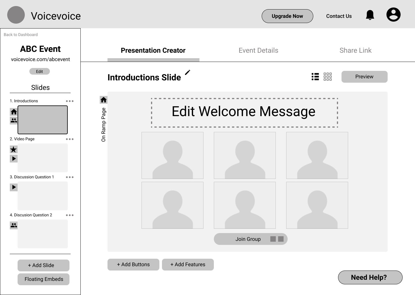
Based on the decisions we made from sketched solutions, we implemented it into a lo-fi wireframe in Figma.
Dashboard page
Event details
Conversation creation page
Share links
Card view
9 usability tests, an overall 3/5 rating on intuitiveness
In total, we did 9 remote usability tests on the lo-fi prototype. We first introduce our users to this platform and its purpose. And we conducted 7 tasks for users to complete. After the testings, we went back together to share the feedback we each got. We used Miro to collect and share the feedback we received individually to mark where needs to be iterated and how users feel on each page.
Feedback from the first round user testing
Dashboard: Confusion with the wording(conversation or template), need an introduction of what this platform is about.
Conversation creator: Need instructions on the steps, some buttons are confusing in what they would do, confusion with the word ”presentation”
Event detail: Many terms feel unnecessary, like one scroll page rather than click on the sections, “save” and “next” buttons are not consistent
Share links: wish to share the link directly instead of just copying
Iteration 3: Hi-fi prototype
Integrating from the feedback we collected on the lo-fi wireframe, we implemented users’ feelings and suggestions in the hi-fi prototype.
Thw style guide is provided by our client VoiceVoice*
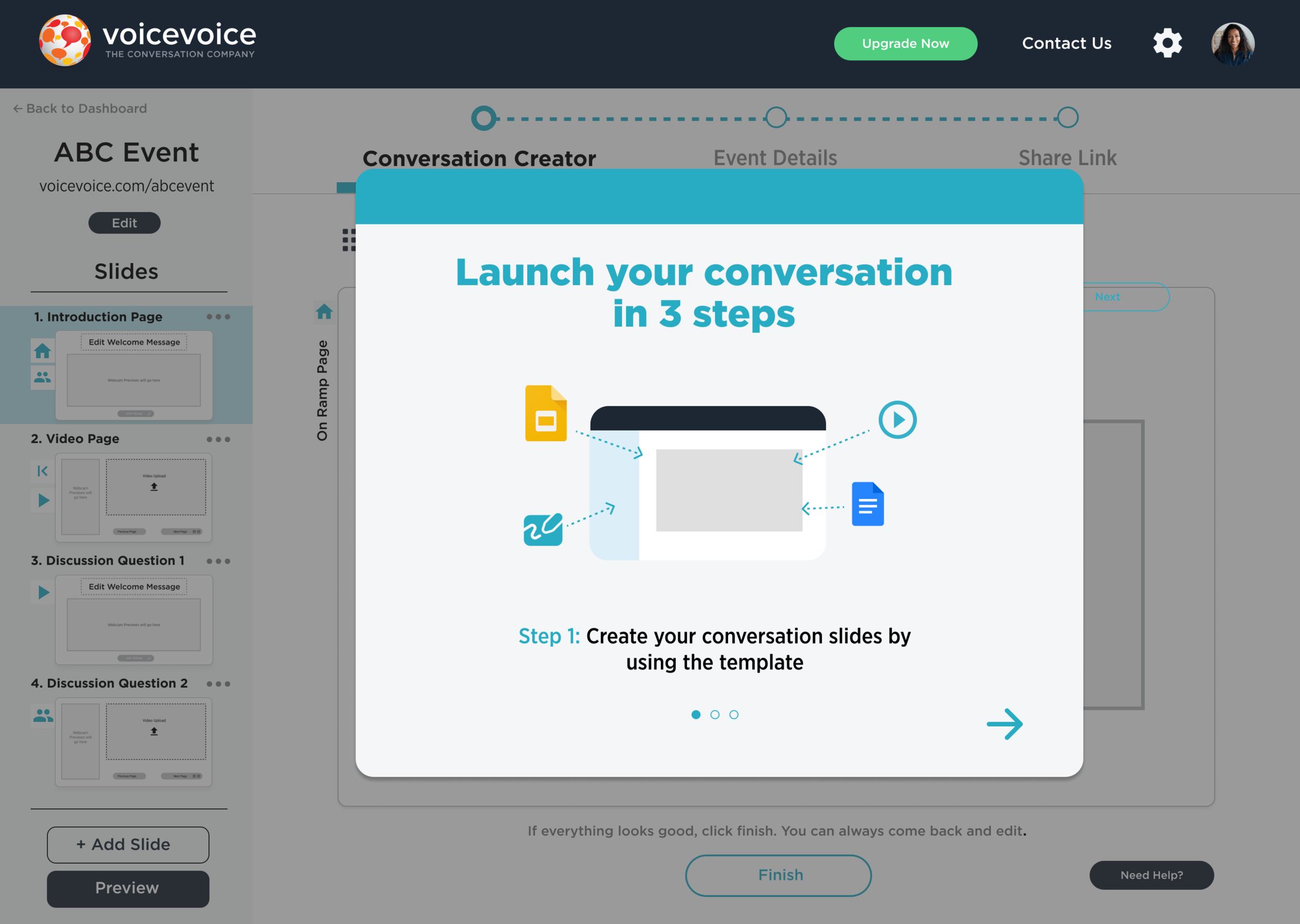
Dashboard page
Changed “free template” to “free conversation template”
We changed the wording in the empty space to make the space more clear for recently created conversations
Minimize the “need help” button to emphasize other important options
Show the essential steps before they started editing their conversation to provide an overview of future steps and indicate the process is easy
Conversation creator
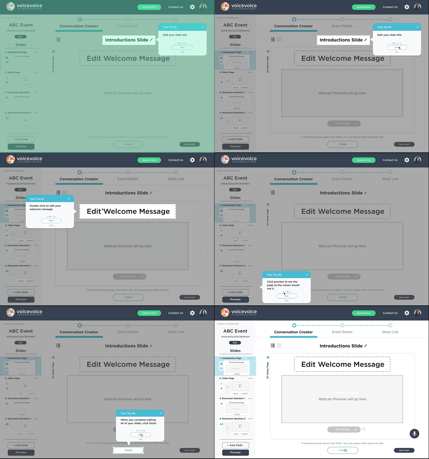
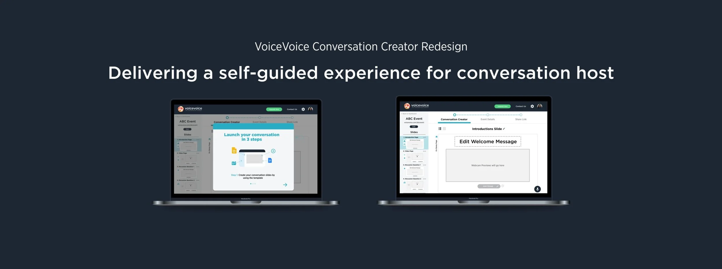
Conversation creation tutorials pop-ups
Provide tool tips to guide users step by step when they start editing.
Have the progress bar on the top to inform users which step they are at
Have a “question mark” next to the button that needs clarification so users can click on it to read
Have a “finish” or “next” button to indicate the page is complete
Have the preview button on the left to leave more attention to the editing panel
Replace the profile image with a webcam area to avoid the confusion
Conversation editor
Event Details page
Allows users to share the link to their participants directly from this page
Implement a progress bar that shows the users which section they are editing, and allows them to quickly access each section
Change the page into a one scroll page so users can easily skip the input box that they don't need
Have a preview window next to the registration page to show users what the registration page will look like
A bottom bar that allows users to move back and forth so they will have a button to click on when they finish
Share links page
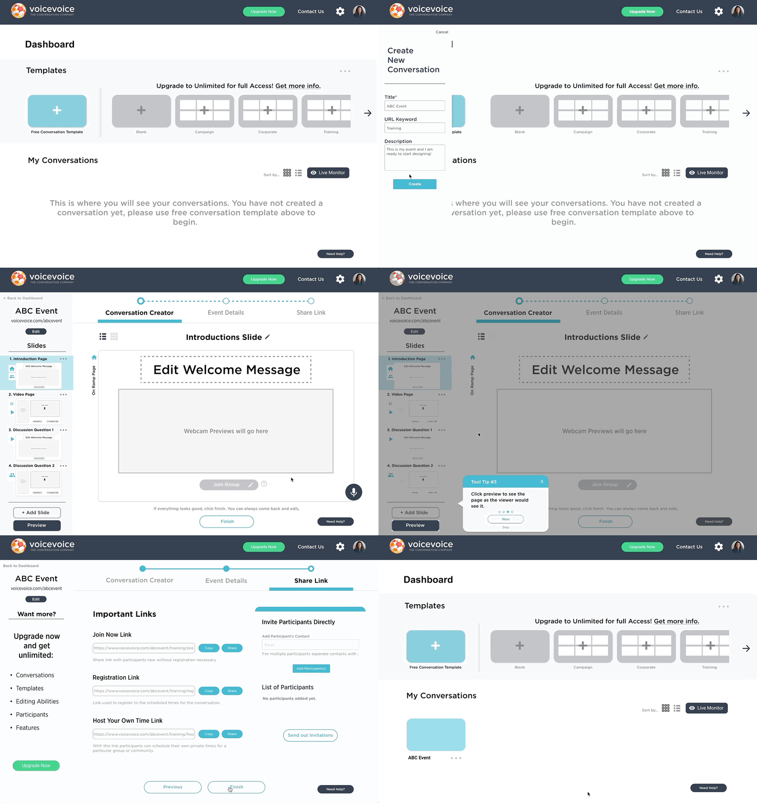
Final Prototype
Conclusion
Second round User testing on hi-fi prototype
We tested 7 users in total for this second round including the previous users that we have already interviewed and new users who are the first time using this platform. They come from a variety of backgrounds including tech-savvy and non-tech savvy.
The valuable feedback we received:
Want a go back button on the steps in the tutorial card pop-up.
The microphone icon needs more instructions.
Webcam preview rectangle is the same color as the rectangles that require action (upload video), there should be a difference.
“On-Ramp” should not be vertical, it was missed by one of the user testers.
User’s didn’t know they could use a “Join Now” link without having to fill in these details.
Registration and post-event email boxes are too big for the actual text that would be inputted.
There are no asterisked required items on this page.
Users feel that host your own time link should appear when they scheduled time on the event details page
Confusing vocabularies that need to be surveyed: Conversation vs. Presentation/ “On-Ramp”/ “Finish” vs. “Next”/ slide
Conclusion
The existing product has a disorganized flow that users are frustrated with creating new slides and adding features. During this five-week of work, our team has defined the pain points on each step and provides possible solutions. We aimed to help the company scale by creating a more intuitive process for first-time users to create their conversations. Besides the feedback we got from the second round of user testing, we suggested our clients do more rounds of user testing after the iterations in the future. We also highly suggested our client to send out surveys on the wordings that the platform uses.
Takeaways
This is my first group project. I am very fortunate to have a wonderful team. Huge thanks to Mimi and Robert. We collaborated very well along the process. Before this experience, I was always curious about how to work in a team to design since everyone will have different opinions. After I finished this project, I can confidently say that I love working in a team.
The first thing I learn is active communication and closely follow our timeline of the project. We communicate all the time. At the beginning of each week, we would set a goal and different meet-up dates and times. Before each meet-up date, we will complete our portion of tasks, and we would use miro to share feedback.
The second thing I learn is not to be afraid to express your ideas even when it conflicts with others but to be ready to compromise and always target the team goal. When we all did the quick solution sketches, I had really bold and different ideas from my teammates. I did not give up on my design directly but explain to them why I made each decision on my sketched screens, and then they also explained their design to me. We all went back to the problem itself, and take solutions from others’ sketches to create the most problem-centered prototype.


