United Airlines Rebrand & Atmos Design System
Background
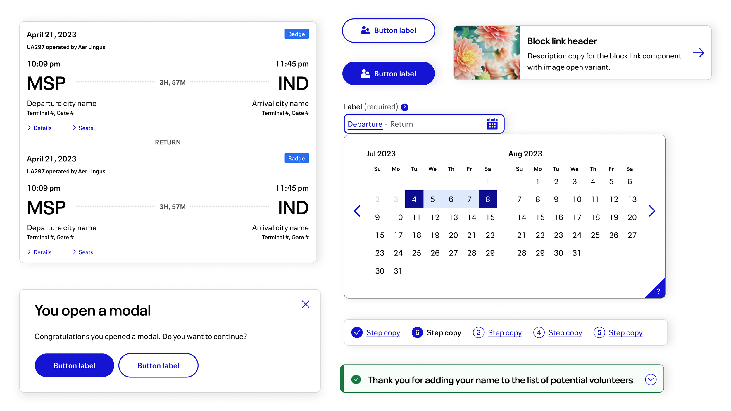
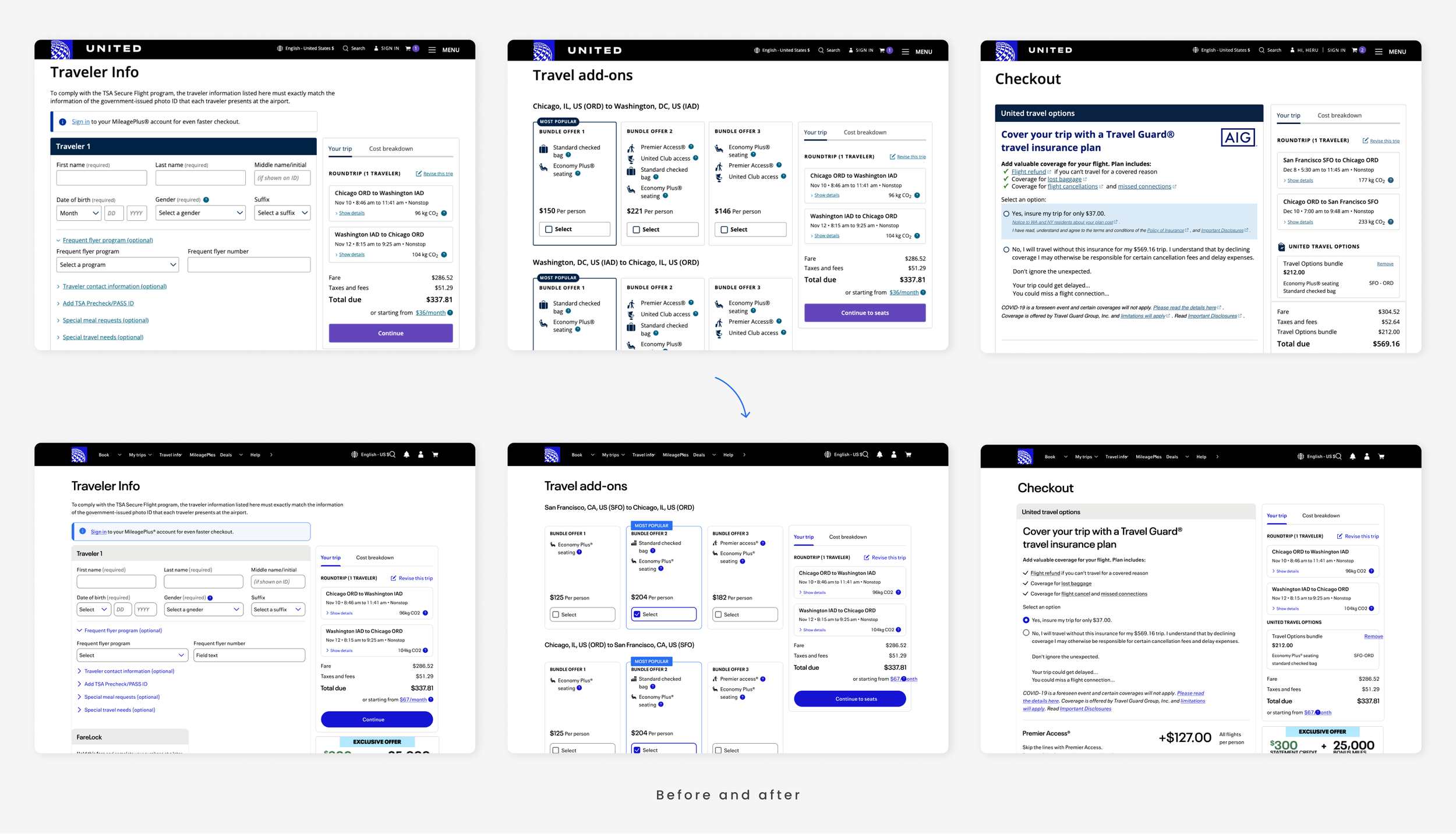
In May 2024, United Airlines launched a bold rebrand of its B2C native mobile app and website, captivating millions of users daily. This transformative initiative introduced a fresh, modern aesthetic that reflects the airline's commitment to innovation and significantly enhances the overall user experience.
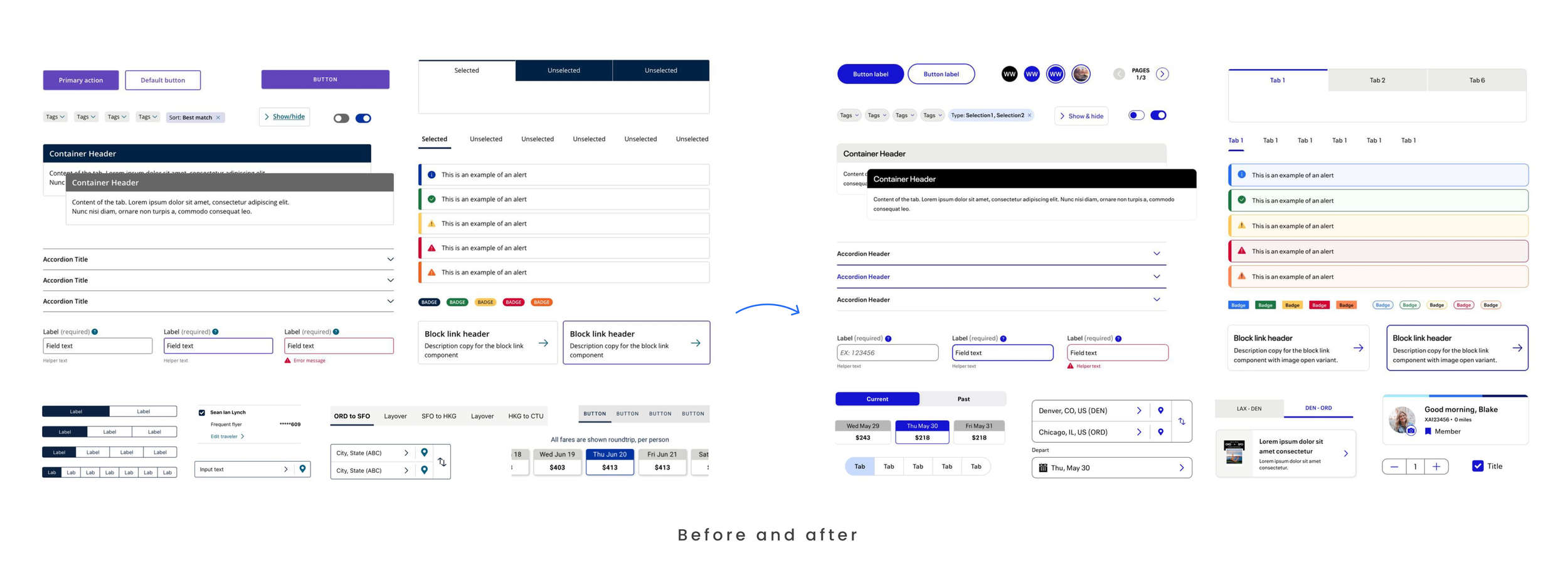
As a member of the Atmos Design System team, I played a key role in evolving the design system by refining existing components to align with the new visual identity while ensuring scalability and accessibility. To foster improved collaboration and streamline delivery, our design team transitioned from Sketch to Figma, paving the way for a more cohesive design workflow.
What I did
In the launch of United Airlines' rebranded design system, I enhanced existing components to align with the new visual identity while ensuring compliance with WCAG accessibility standards. Additionally, I designed new components to address the evolving needs of designers. Leading the migration from Sketch to Figma, I advocated for the onboarding of over 40 designers to effectively utilize the new design system in their design files. I collaborated closely with product managers and developers to ensure the accurate delivery of interaction designs for a seamless website rollout. Furthermore, I enhanced our internal documentation site with clear, detailed guidelines for each component.
Role
UX Designer III
Team
Principal designer, PM, Front-end developer, Accessibility analyst
Project duration
1 year and 4 months (Mar 2023 - Jul 2024)
Outcome
Migration from Sketch to Figma
Why the Migration?
The decision to migrate our design system from Sketch to Figma was driven by the need for improved collaboration, enhanced usability of the design system across teams, and greater cost efficiency. With only one year remaining on our Sketch plan, I was brought onto the team to spearhead this crucial transition, ensuring that our design resources would be optimized for the future.
How I Executed the Migration
The migration process presented a couple challenges that I navigated with strategic planning and collaboration:
Mapping and Designing New Visual Rules:
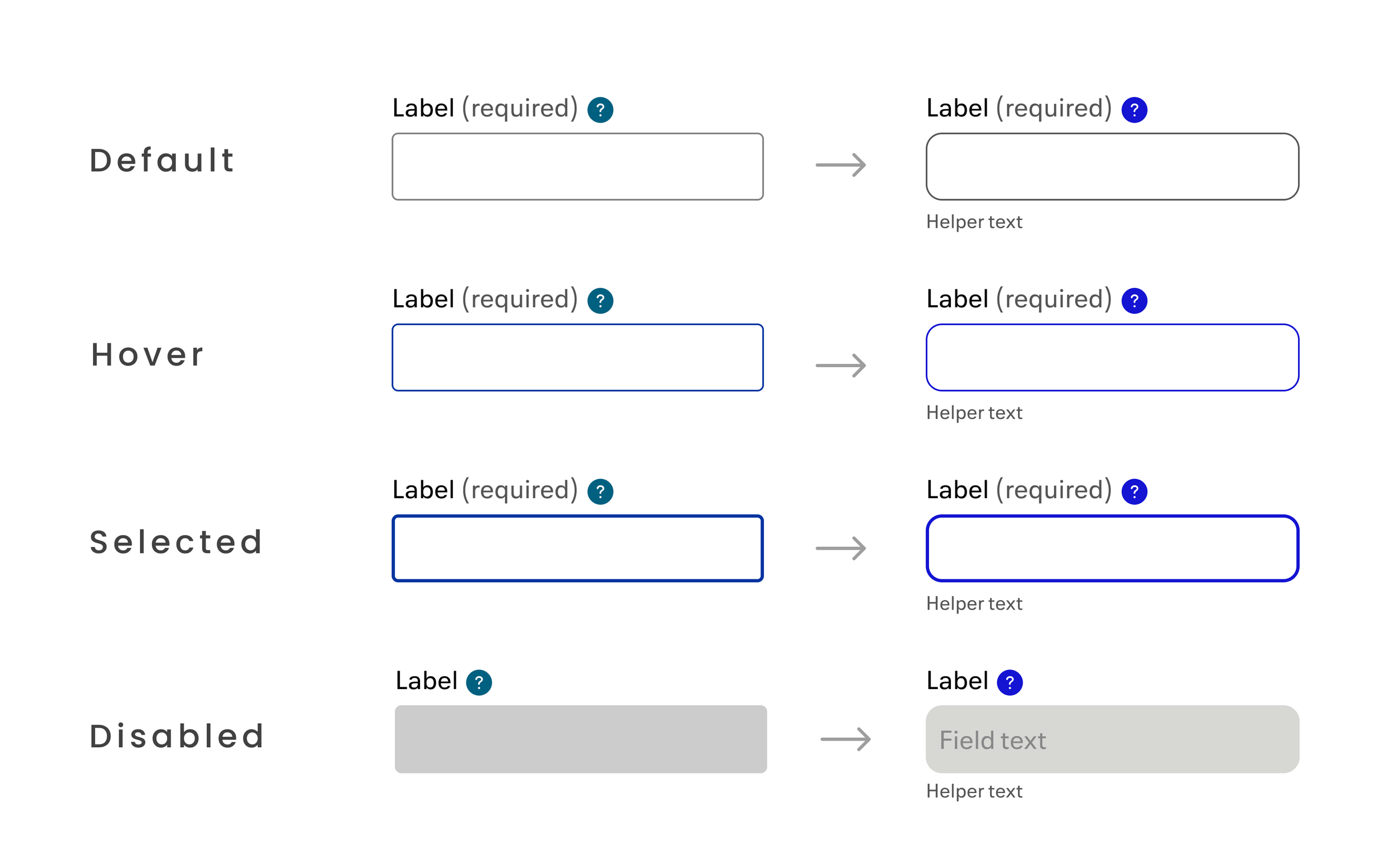
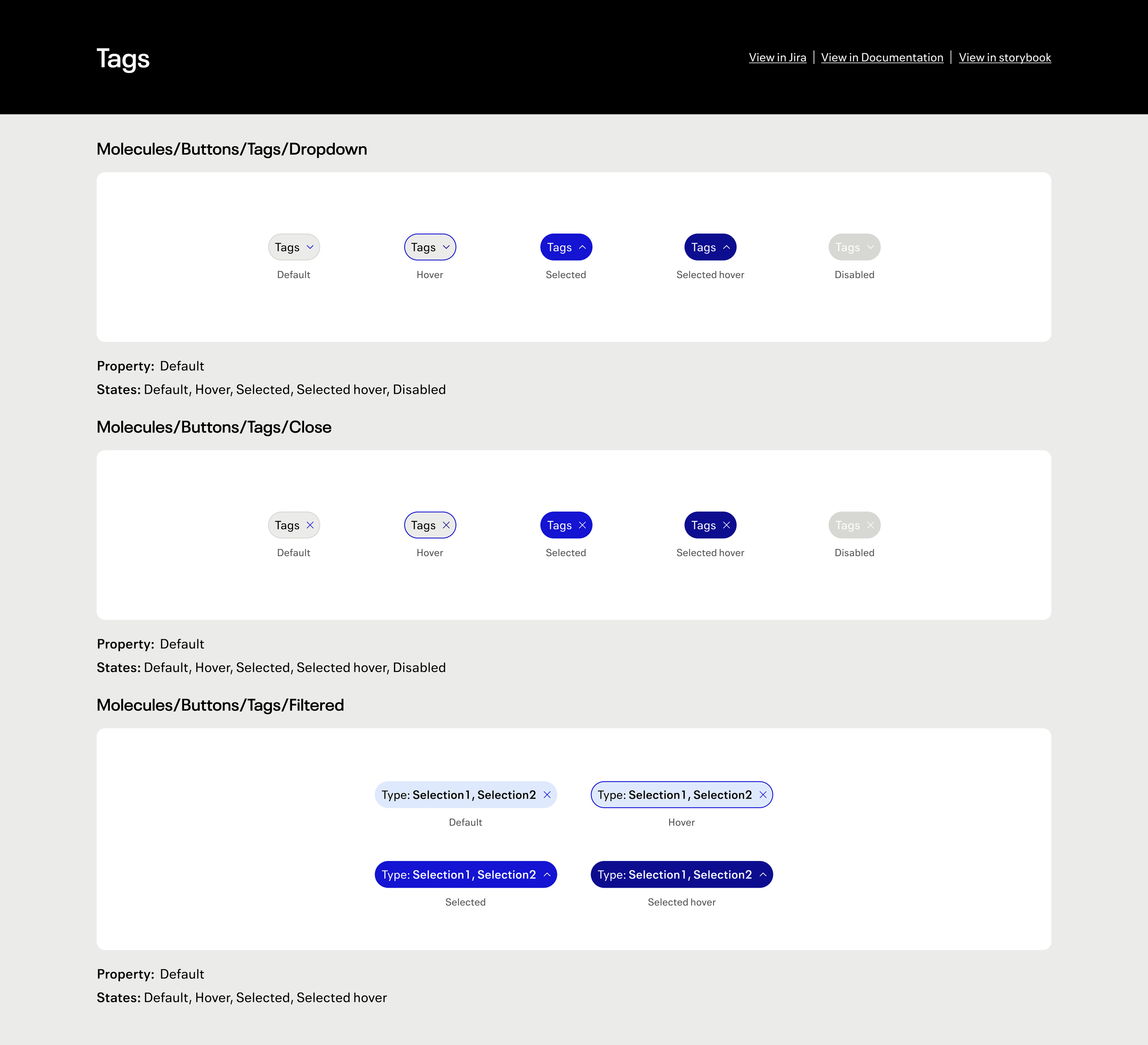
To ensure a smooth transition, I worked closely with our principal designer to get acquainted with the existing design system's patterns, particularly the rules governing color usage and visual indicators for state changes. I mapped the components from the old design system and designed new visual rules for the rebranded system, considering all states and interactions, such as hover, focus, disabled, and inverted states for dark modes. I iterated on these designs within various page contexts to select best practices that aligned with our new brand identity.
Building the Design System in Figma:
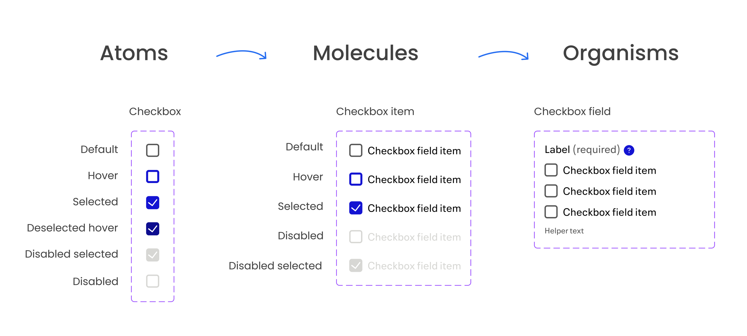
In Figma, I structured the design system into a library organized by atoms, molecules, and organisms. My goal was to create variants that offered flexibility while providing clear guidelines for designers to adapt components based on their specific needs. I prioritized designing an intuitive experience that empowered designers, allowing them to find what they need effortlessly and use the design system effectively.
Design Components with WCAG Compliance
One of our primary goals in this rebrand is to enhance accessibility for all users of our website, ensuring an inclusive experience. I approached this responsibility with great seriousness, focusing on both the enhancement of existing components and the creation of new ones. To achieve this, I partnered with an accessibility analyst to test each design and confirm its compliance with accessibility standards.
My design process began by collecting use cases to understand where the components would be utilized. I studied best practices, purposes, and required states by analyzing our competitors and industry leaders. I then developed several design options that I preferred and presented them to our principal designers, business analysts, and the accessibility analyst for initial feedback and approval.
Throughout this process, I wrote the necessary voice-over text, established a semantic order, and designed keyboard navigation paths to ensure that all users could interact with the components effectively. Once I received approval, I delivered the designs to our developers for implementation in a live environment. We tested the components in front of the team and made adjustments as needed until all concerns were addressed.
From Design to Live Implementation
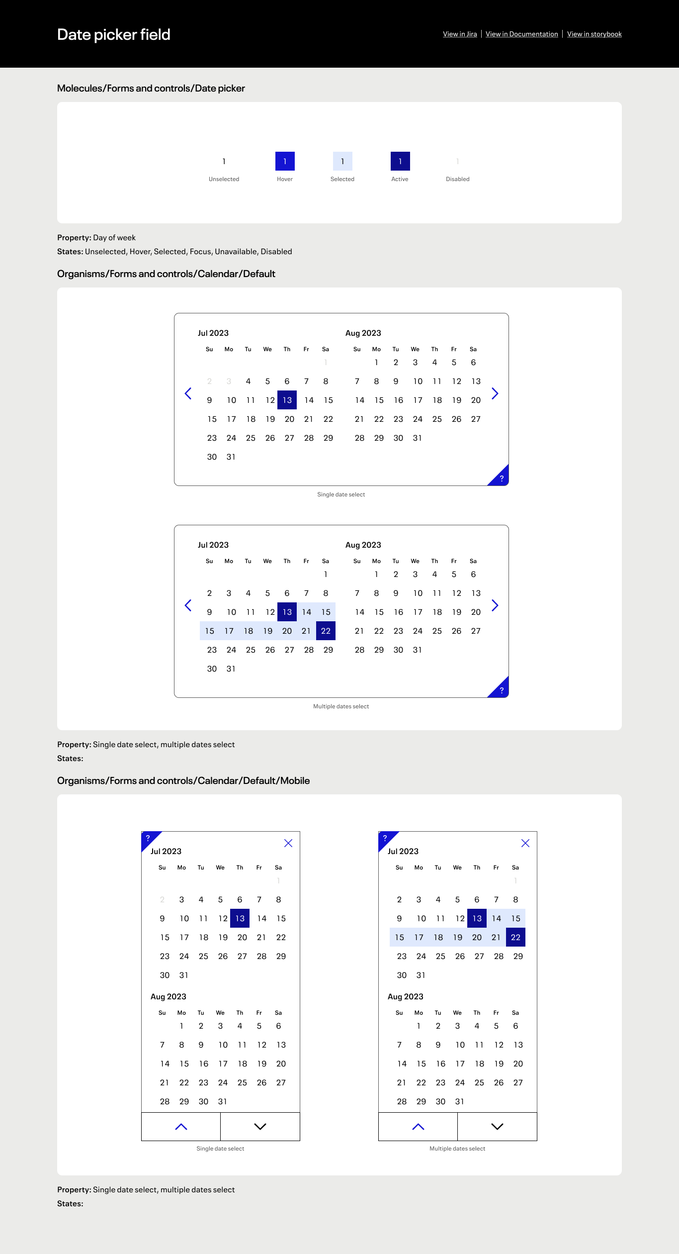
In delivering design to engineers, I prioritize precision and clarity at every stage. First, I provide exact pixel specifications to ensure the design is executed accurately. Next, I focus on conveying the intricacies of interactions, ensuring that developers fully understand the intended behaviors of each component and all its states. To support this, I created a developer deliverable page that outlines every state and provides an accurate reference document, ensuring consistency in the design process. Finally, I emphasize the importance of keyboard navigation, ensuring that accessibility is integrated seamlessly into the implementation. This layered approach fosters effective collaboration and results in high-quality, user-centered designs.

