Project Overview
During the pandemic, we are trapped inside the buildings. However, breathing fresh air and going out are essential for our mental health. When public transportations become unavailable, popular parks are closed from time to time. We realized that we really do not know many places to go to even just for a walk or for a hike.
Why I Created This App
I created this App CheckIn for people who have the need of finding covid-safe places to quickly find the place, easily evaluate the place's safety, and keep track of their steps.
CheckIn App
Play tourist in your own town during the pandemic.
Skills User Interviews, Competitive Research, Affinity Mapping, Personas, Journey Map, User flow, UI Design, Usability Testing
Duration 5 months
Project Type Solo UX project
Tools Miro Figma
Everything starts from a question that I got asked a lot by my friends “Where should I go during COVID?”
How might I help people find safe and close places to go during quarantine?
The problem I am trying to solve is:
Whose problem am I solving for?
To remind me whom I design for throughout the design process, I constantly come back to check these characteristics and pain points of my users in order to ensure my design is solving the right problem.
People
who go out regularly
who closely follows covid safety protocols
who feel difficult to explore new places
who like to explore new places
who are willing to share their experiences and love seeing other people’s feeds on social media
Pain points:
places are often too crowded
information about covid is outdated
Do not know their areas well
Taking public transportation is dangerous
Have to use several websites to do the research
Key Features
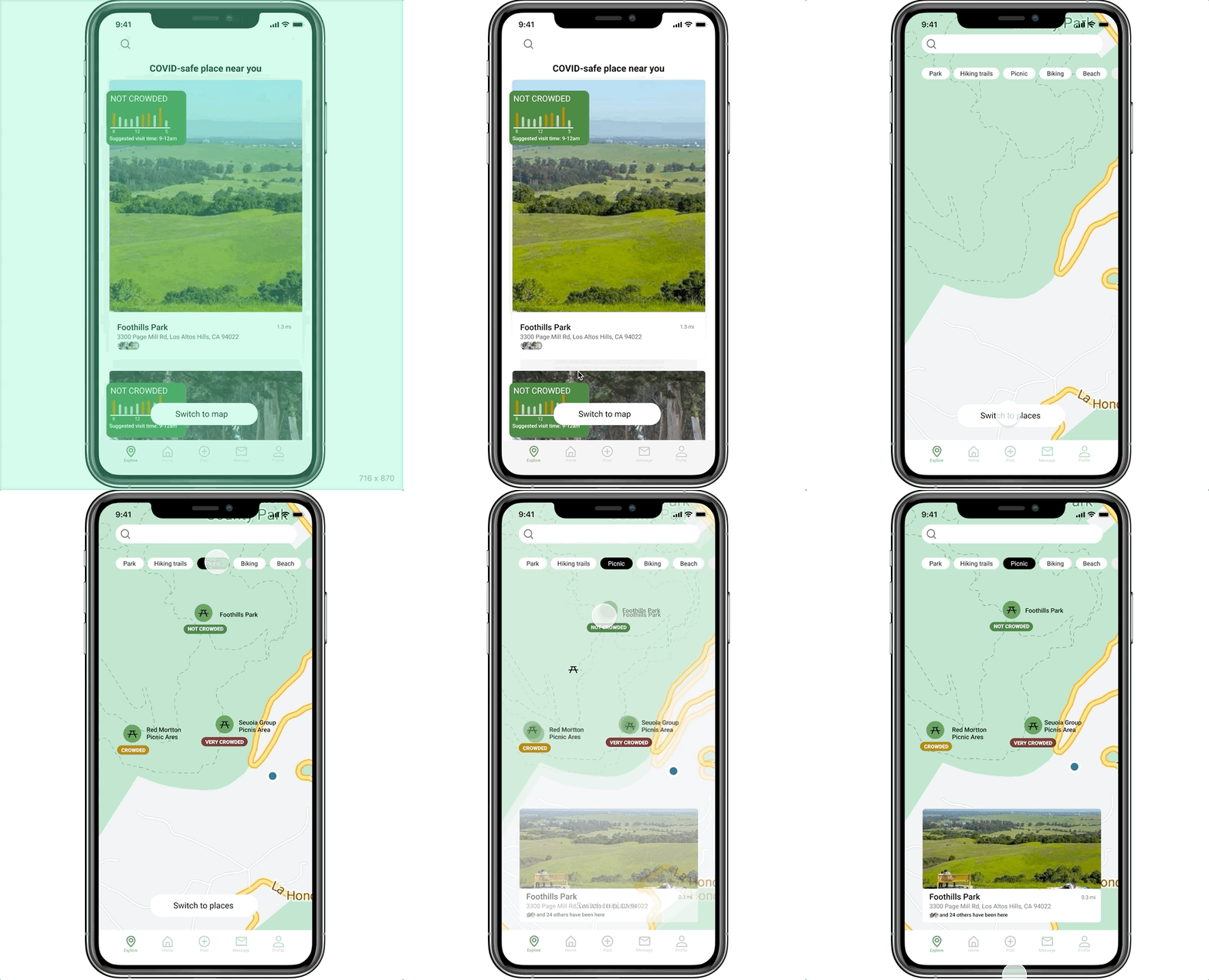
Use the map view to quickly evaluate the safety of places and decide where to go in real-time
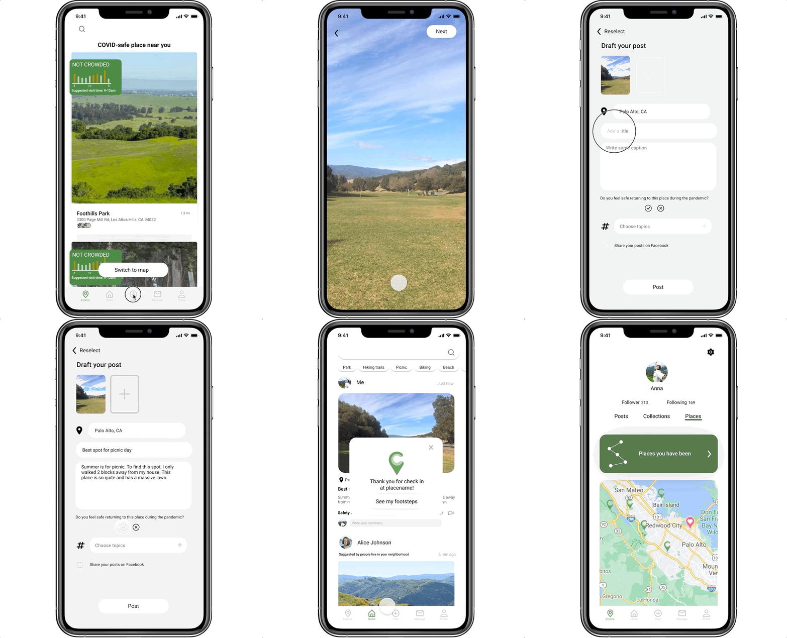
2. Browse Friends’ feeds and save the places to collections for future chick-in
3. After visited a place, post about it and check in on the map
My design process
Research
What has already existed on the market that may solve the problem?
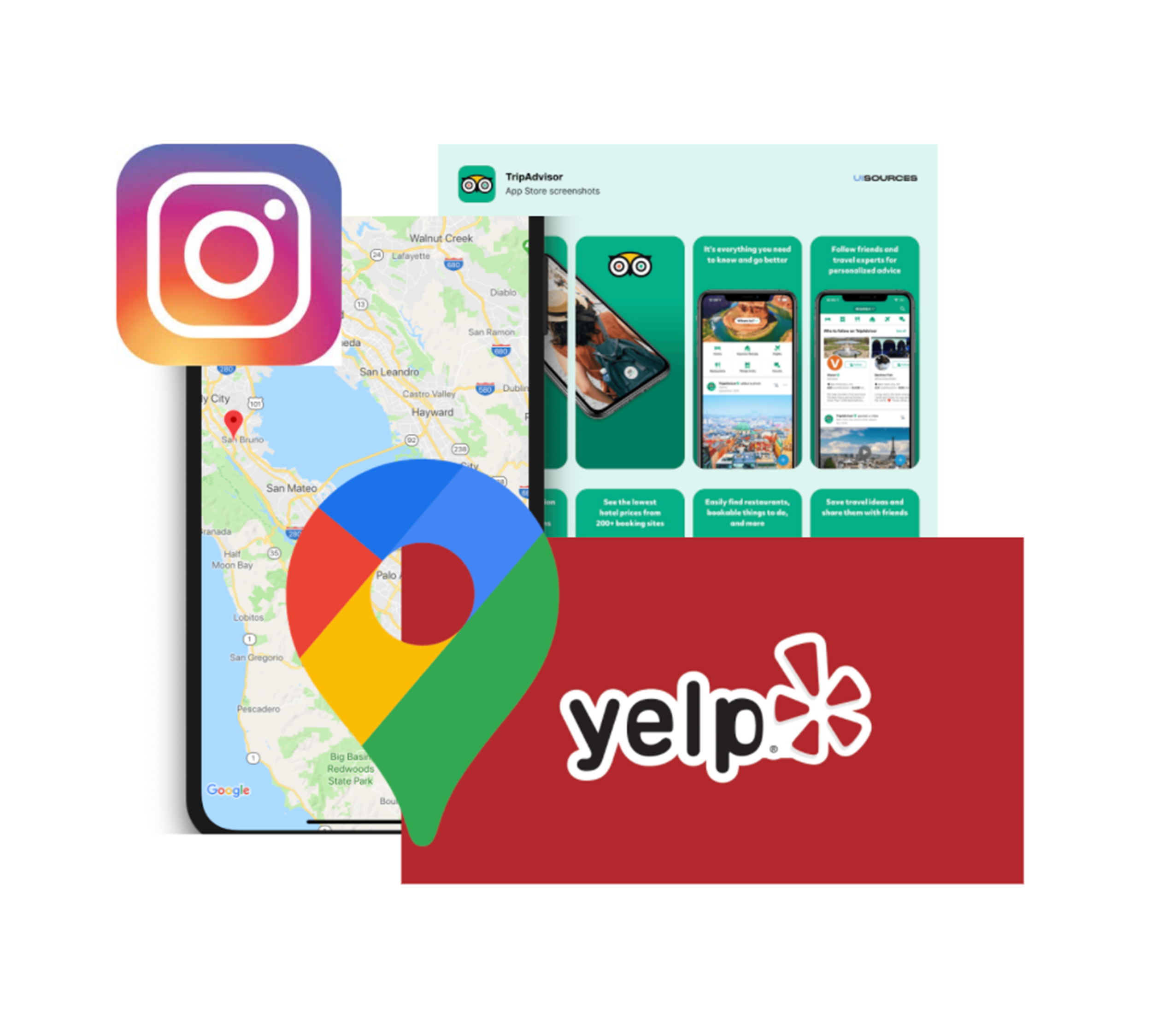
Trip advisor, Yelp, Instagram, Google Map
There are four existing apps that might solve the problem. They are from four categories: navigation, social media, traveling, and review.
Instagram has the location tag, however many users do not use it purposely.
Google map does not show the details of walking distance navigation and lacks comments.
Yelp focuses more on business reviews.
Tripadvisor mainly targets tourist attractions.
Based on the result of my secondary research, even though there are some tools in map navigating, and places recommendation, there is no app that provides detailed information of nearby neighborhoods. They focus more on tourist attractions or driving routes. Especially during covid, people have no direct tools to help them explore their nearby places.
Users interviews help back up my secondary research result and validate the problems users actually face.
I interviewed six participants who have similar interests to go out and struggle with where to go during the pandemic. The goal of this interview is to find out where their struggles are from, what activities they like to do, and how they decide where to go.
Affinity mapping to sort the users interview information
After the interviews, I used an affinity map to sort my findings into four key categories that reflect users’ pain points.
Location and transportation: they all like to know somewhere nearby that is within walking distance
Update information: updated information about a place is important
Research process: research process is relatively complicated and inconvenient, even unfruitful sometimes. They have to go through many different sites to gather the information they need.
Social media habits: People trust posts on social media rather than strangers’ reviews.
Ideation
Using affinity mapping, user stories were created. These users’ stories help me identify the main screens users would like to access first to begin their red route.
Site map
Sketches of three red routes
Identifying the first level and sub-level contents help me move on to sketches. These quick sketches help me figure out the basic structure of the app and generate intuitive solutions to users’ problems.
Flow I - navigate on the map and quickly evaluate the crowdedness
Flow II - Browse and save a place for later
Flow III - Post and check-in
Sketched solutions
Low-fidelity wireframes
Sketched solutions
Guerilla Testings
5 remote testings were done through Zooms. I purposely selected participants who are my targeted users including several participants who have done interviews with me in the past. The objective is to test the usability and purpose of the app. I conducted a list of tasks that required users to complete on their own when they navigate the screens. They were also given specific prompts and scenarios before they start clicking on each flow.
Feedback
The usability works well on each screen, users have trouble understanding the main purpose of the app because it has a lot of other features that feel equality important.
predicted crowdedness will be very helpful for deciding when to go to a place.
Label the icons before the test
Show parking, facilities, activities on the place home page
the first page can be a card view instead of a map
After making changes based on feedback, I moved onto the most fun phase of starting my Design Style and UI Kit to further enhance the purpose of the app.
Design & Prototype
Branding
My design goal is to allow the users to have a refreshing and crystal clear interface to interact with. Therefore I chose green as my theme color to reflect on nature and the outdoors. For the overall layout, I used minimalist design to delight users’ navigating experience.
Mood Board
Mood Board
Logo
I used text and symbols to create this logo. The pin represents location, green represents safety and nature, and C represents “CheckIn”. This logo delivers the energy of the app which is relaxing, healthy, and active. The overall style is minimalist and modern.
Style guide
To keep the style constant, I created a style guide. I did not use many accents colors so I can keep the page as minimal as possible. I mainly used different shades of grey to write the contents and used green as accents colors highlights users selections. I also used a 8-column grid to have every page aligned to each other. All the shadows and buttons have the same style so that the screens can look organized.
Hi-fi prototype
Test and Iteration
To really stand at users’ positions and see if my design works, I conducted five user testing interviews with users who have the need of exploring new and pandemic-friendly places around their neighborhood. I recruited the same group of users from the first round of user interviews. The user testings were all remote through zoom. I asked my users to share their screen and use my Figma prototype link to interact with the app. My goals for these testings are to find out all the problems with app usability as well as to emphasize the purpose and clearly fulfill users’ needs.
One of the major changes in the main screen in the app. The first version did not help users to quickly discover the crowdedness of places on the map at first glance. I used a larger card view on version 2 to allow users to see at first sight. I also place not crowded signs at the most prominent position on the card view to indicate the main purpose
Before
After
Takeaways
This project is my first UX project ever. When I first learned about the mythologies of UX, I think UX is just like a mathematics equation, once I have done all the steps and follow the rules, my project will be successful. After I have done a couple of tasks for the CheckIn App, I realized how helpful these tasks are to help me move on to the next phase. This project helps me to learn to do everything with a purpose in mind and always work towards the purpose. The results can be much different between research without a question and research towards a question.
Not simply following the design steps but think deeply about what is the purpose of each step
Generating solution sketches can be really fun. It can also get a little too far from the problem statement. As I was designing and problem-solving, it was easy for me to think horizontally and start designing more features instead of thinking vertically into users’ needs. Having users’ needs in mind this whole time, I have to constantly go back to users’ interviews and persona to make sure that I am solving the exact problem. Without talking to users, I would not know where this app is not working.


